Problem
How can we create a more efficient way of shopping for groceries when after we arrive home from the supermarket, we realize we have forgotten sometimes the most essential items? Based on secondary research, it seems like everyone has this problem. How can we reduce our carbon footprint while doing this task more effectively?
Competitive Analysis
Being competitive in an already crowded market with big players like amazon fresh, instacart and shipt, was not easy. We wanted to build something simple and useful. My approach was to remain focused on what was missing from the already existing apps and to overlap their features. https://docs.google.com/document/d/1WFLTuo_CHvVqf0Be-RIlWP7j35Ur7RnuSq3WRid2ZTA/edit#heading=h.5x0d5h95i329
I continued the discovery phase with a usability heuristic analysis. I used Norman & Nielsen rules of thumb for good interaction design to learn more about competitors and understand where their strengths and weaknesses were to create a superior product.
Heuristic Evaluation
I selected the following areas as most important for the evaluation:
The problem, I set out to solve in my capstone project; Is when you forget one essential item at the grocery store, what do you do now, what are your options? >
Instacart, Amazonfresh and shipt are popular apps in this space. The best being Amazonfresh who is the market leader in this space. The first thing you will notice is that all these services require a monthly subscription fee and do not deliver one or two low cost items as it is not economical to their business model, but based on secondary research is an essential need for Customers in every state in the US and the world.
Nielson Norman Group’s 10 Usability Heuristics for User Interface Design.
Visibility of system status
The system should always keep users informed about what is going on, through appropriate feedback within reasonable time.
Match between system and the real world
The system should speak the users' language, with words, phrases and concepts familiar to the user, rather than system-oriented terms. Follow real-world conventions, making information appear in a natural and logical order.
User control and freedom
Users often choose system functions by mistake and will need a clearly marked "emergency exit" to leave the unwanted state without having to go through an extended dialogue. Support undo and redo.
Consistency and standards
Users should not have to wonder whether different words, situations, or actions mean the same thing.
Error prevention
Even better than good error messages is a careful design which prevents a problem from occurring in the first place. Either eliminate error-prone conditions or check for them and present users with a confirmation option before they commit to the action.
Recognition rather than recall
Minimize the user's memory load by making objects, actions, and options visible. The user should not have to remember information from one part of the dialogue to another. Instructions for use of the system should be visible or easily retrievable whenever appropriate.
Flexibility and efficiency of use
Accelerators — unseen by the novice user — may often speed up the interaction for the expert user such that the system can cater to both inexperienced and experienced users. Allow users to tailor frequent actions.
Aesthetic and minimalist design
Dialogues should not contain information which is irrelevant or rarely needed. Every extra unit of information in a dialogue competes with the relevant units of information and diminishes their relative visibility.
Help users recognize, diagnose, and recover from errors
Error messages should be expressed in plain language (no codes), precisely indicate the problem, and constructively suggest a solution.
Help and documentation
Even though it is better if the system can be used without documentation, it may be necessary to provide help and documentation. Any such information should be easy to search, focused on the user's task, list concrete steps to be carried out, and not be too large.
My Research Approach
I used a user-centered design process:-
1. Conducting primary and secondary research to fully understand the problem.
2. Ideating based on our usability testing and research findings.
3. Creating a few low fidelity prototypes to test ideas and assumptions to either prove or disprove my hypothesis.
4. Finally, I then created high-fidelity prototypes as our final product solution.
5. I placed everything, I learnt from User research on a white board with sticky note pads and created an affinity map.
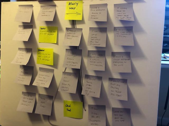
Affinity Map
What I Discovered
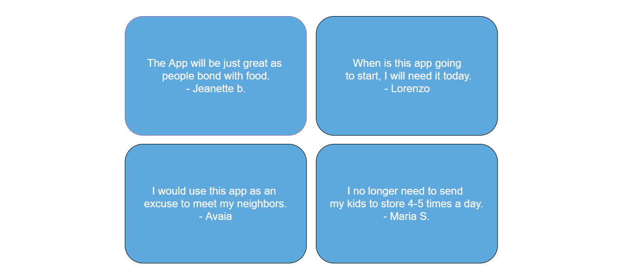
At first, I did not have a clear understanding of user goals and what motivates them. After using the various usability techniques. I designed the app around the user experience and from the insights of user personas. The toogthr app, is now designed to enhance people’s lives, and make the shopper of the home, a greater super hero than she has always been. While conducting research during multiple usability testing sessions, this is what people said about the app, when they saw the high fidelity prototype.
Who am I designing for ?
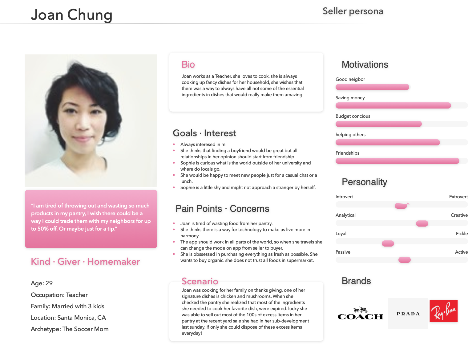
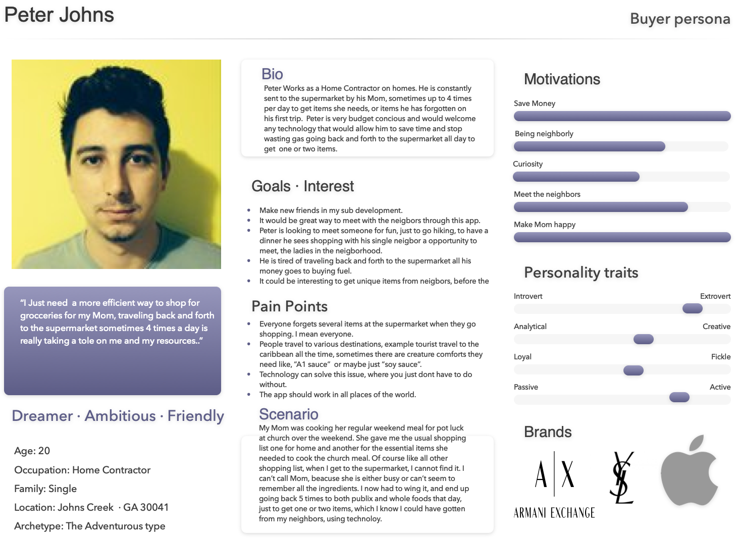
Based on the data I collected, I created representations of two major user persona types. The personas did not depict specific people but combined a number of versions, of the persons studied and interviewed, during the user research interviews.
MEET THE USER PERSONAS FOR THE TOOGTHR APP
Ideation
My role was to undertake early market and user research before the kick-off of the design process, to form a concept for the solution, the formation of ideas. That way, we could kick off with research data, about the problem we were trying to solve. My starting point was to try and learn more about the emotions and motivations while shopping, to gain empathy and understand the entirety of the experience through secondary user research. I found some interesting facts and details about the psychological impact of shopping and human behavior.
Then, I worked extensively on user research and evaluation during the different stages of product development. Then I moved forward and conducted a survey among potential users, it included 10 simple to understand questions with 7 participants. What I learnt from the survey it helped me gain more quantitative data about the grocery shopping experience to build a solid start, for further steps into the design process
WHEN AND WHY WE FORGET TO BUY
Abstract
We examine consumers' forgetting to buy items they intended to buy. We show that the propensity to forget depends on the types of items consumers intend to purchase and the way consumers shop. Consumers may shop using a memory-based search by recalling their planned purchases from memory and directly searching for the products. For example, Consumers may use the search function at an online store. Alternatively, Consumers may use a stimulus-based search by systematically moving through a store, visually scanning the inventory and selecting the required items as they are encountered. Using an online shopping paradigm, we show that Consumers are more likely to forget the items they infrequently buy when using the memory-based search, but not when using the stimulus-based search. When using the stimulus-based search, Consumers are sometimes even better able to remember the items they infrequently (vs. frequently) buy. Moreover, Consumers fail to take these factors into account when predicting their memory. As a result, they do not take appropriate actions to prevent forgetting (e.g., using a shopping list). Quote from researchgate.net.
Wireframing
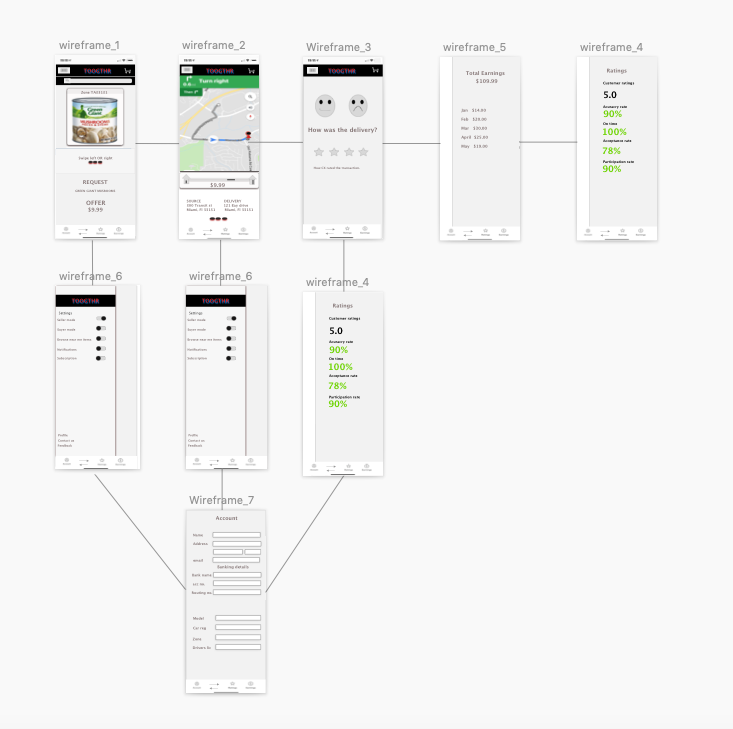
Once I created sketches of the product, the next step is to create wireframes.
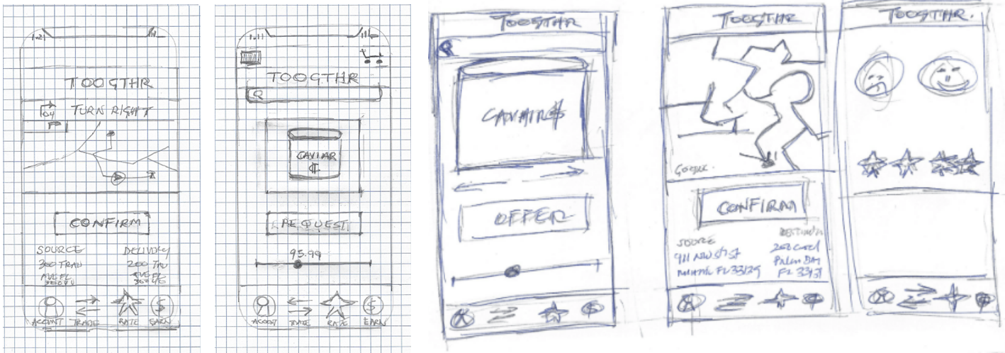
Wireframes are digitized versions of my sketches. Creating a low fidelity digital version of my product will enable me to ideate critical design decisions that, I will need to make, while still offering enough flexibility. While, I formulate the concept during the start of the design process.

Usability Testing
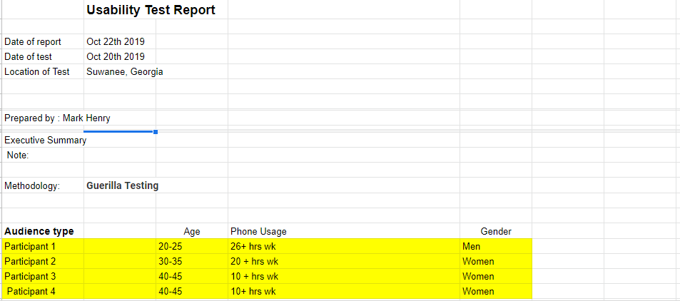
The method, I used to get initial feedback on designs, I made was to do guerilla testing; It’s a quick, cost-effective way to learn what users like about my designs and what aspects of my design are a bit less intuitive. When conducting guerilla usability testing, I asked random people at my sub-development clubhouse, mall and the library, to test my prototype on a sketch cloud on my iphone. I learnt a lot about the pain points of my design, along with the need to adjust certain aspects of my initial design.
After, I designed the first prototype in sketch, that designed changed many times to the final design, centered on the user experience, during multiple usability testing sessions. Users were tested using the prototype animated in invision on the iphone platform, for pain points and unaccomplished tasks, users were observed and interviewed using the following usability script:-
“Hey thank you for taking some time to assist me with this project. Here is a prototype of an app I developed, I would like to test the prototype with you, and it won’t take too much of your time. I just want to learn if the app will enhance people’s lives and work as intended. I will ask you to complete a couple tasks and that will be all. “
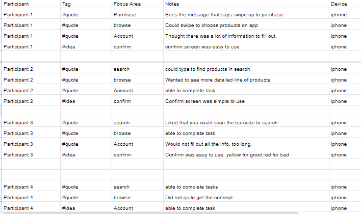
The data from the usability session was gathered on the usability session notes. Diagram 4a.
Prototyping
The Initial design before the user testing sessions, which I prototyped in sketch.
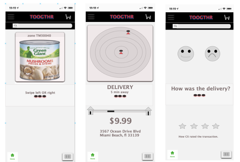
How the design changed after usability testing sessions
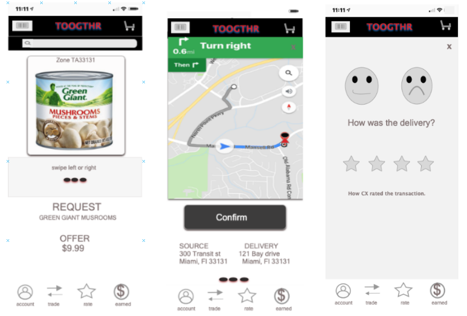
How the design changed after usability testing sessions.
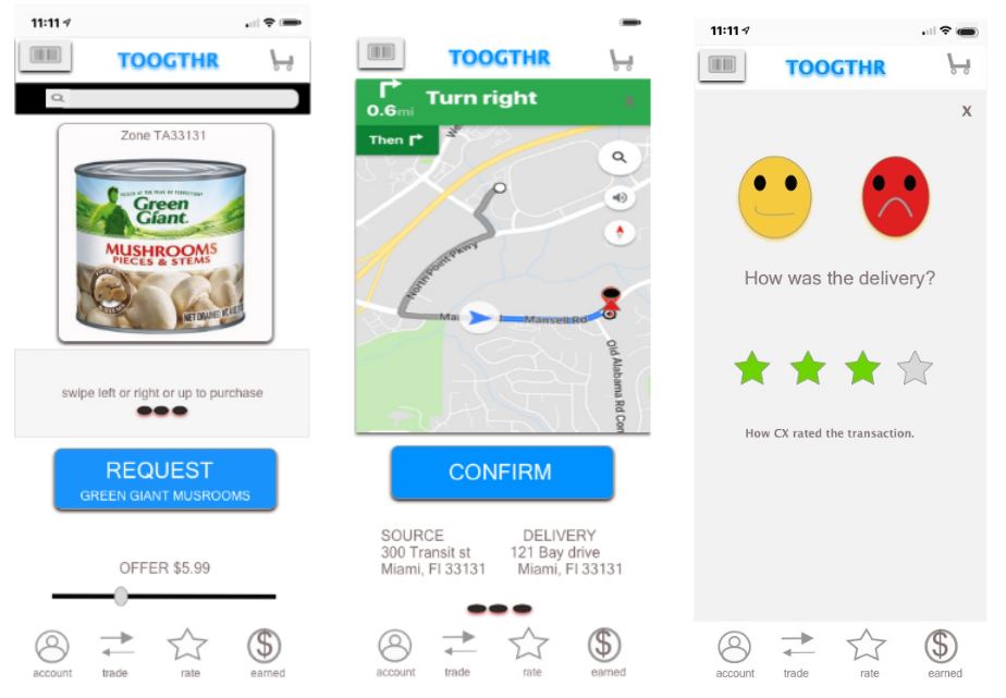
Implementation
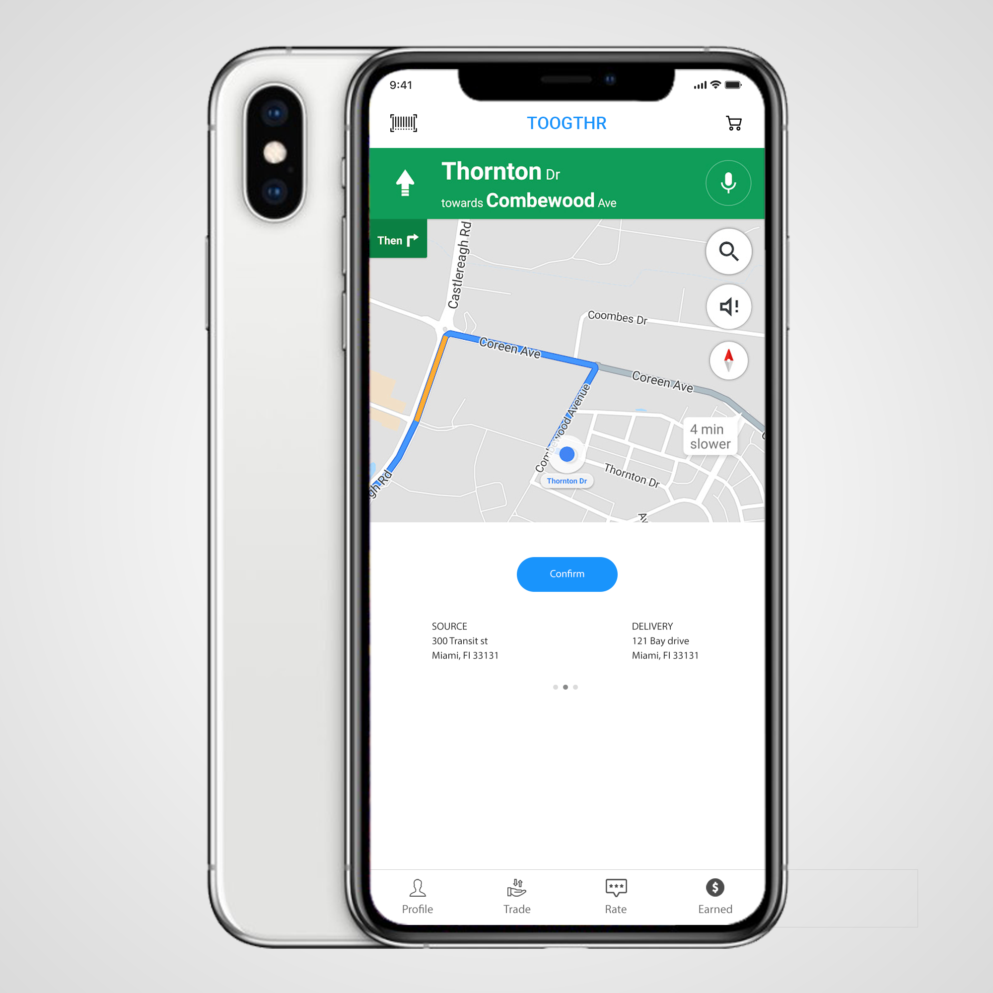
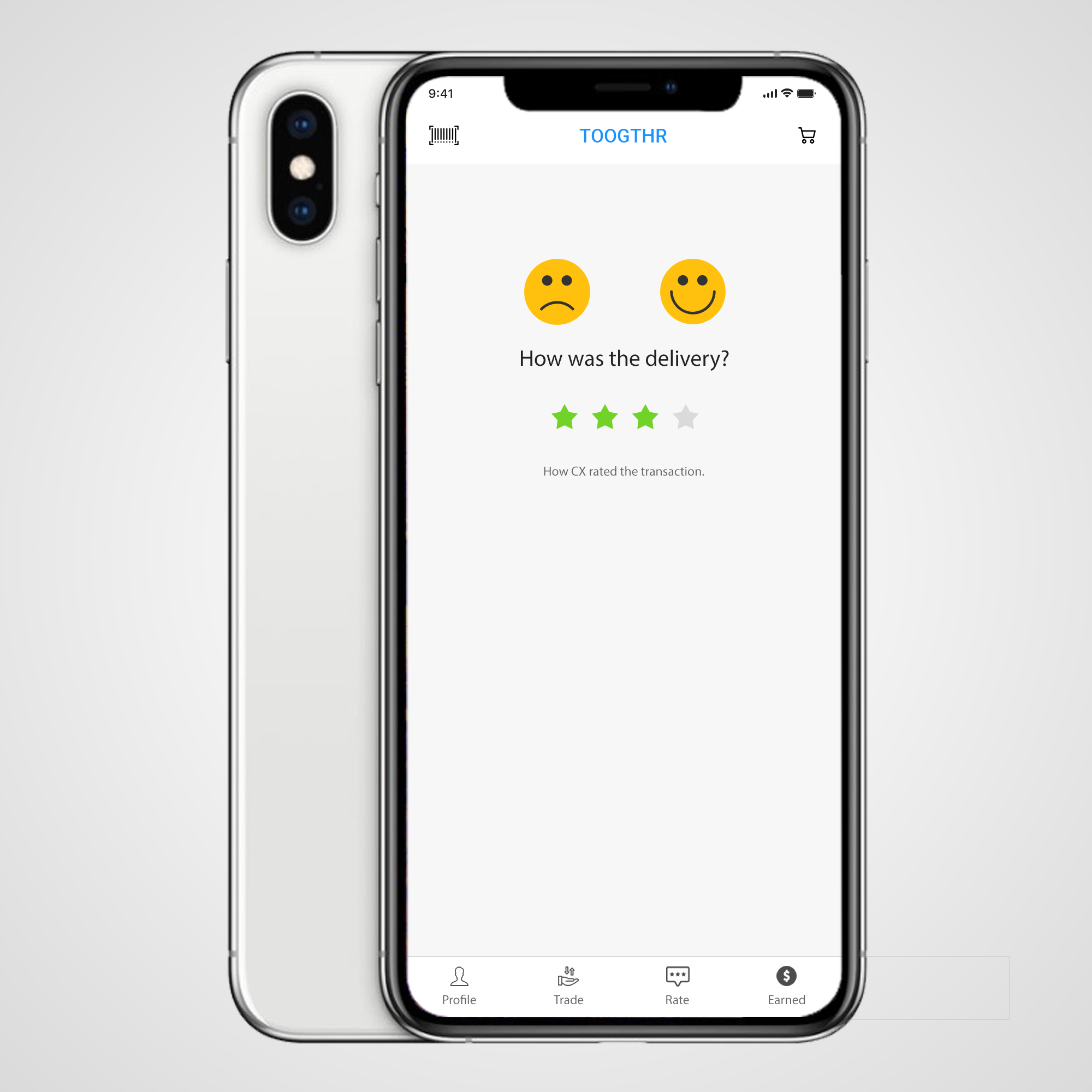
How the design changed after usability testing sessions and user research, habits and motivation to produce the final high fidelity product centered around the user experience.
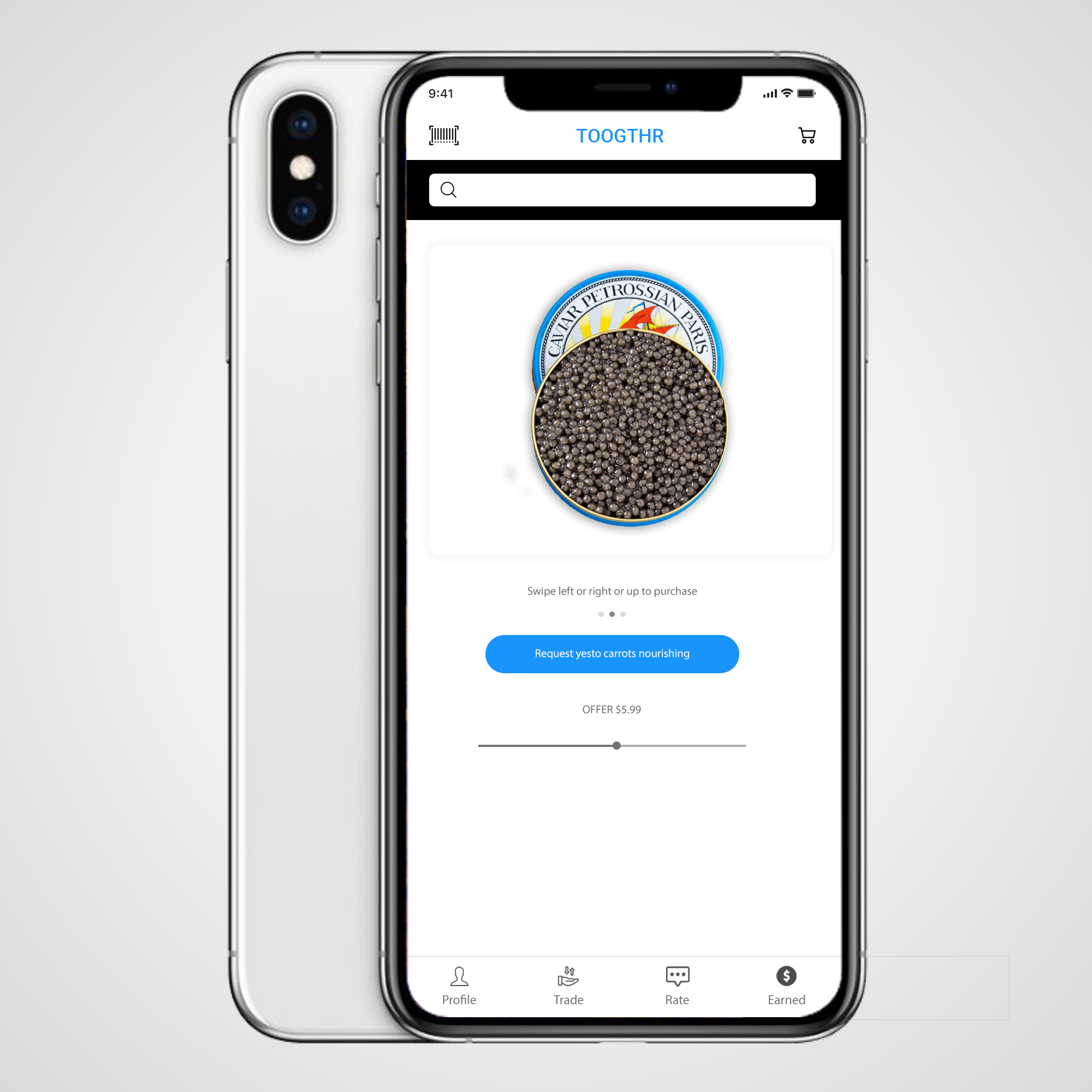
Validation
This design project allowed me to use all my skill set in regards to the user-centered design process. I started with a simple idea, what if we could use technology to trade our pantry, with our neighbors, would this be a solution that would be embraced by many.
Would we use this unprecedented access using the toogthr app, make the grocery shopping experience more efficient, as a filler when we forget essential items, would this bring our communities closer together as a by-product of local trade. Would we trade with our neighbors in real-time, rather than constantly sending our kids or others to the supermarket, sometimes up to 4 times per day or more to fulfill the food preparation process?
The answer is yes.
Test
I am passionate about, the ability to get insights from observations on how the target Users in the field; engage with the final product, to know and understand their behaviors and usage patterns. This data is used to constantly improve the user experience of the product. One can truly see, such a research process is invaluable, as this would guide and ideate future revisions of the application in order to make it more engaging.
Final thoughts
I strongly believe the simple minimalistic design of the toogthr app is the right solution; based on physiological principles and user design. When you understand what motivates or disillusions a person, you can build designs that will persuade your users to engage with your product in a way that either helps your business (this is known as conversion), helps themselves in enhancing their lives, or both.”